Project Overview
Ithaca Soap is a high-fidelity, mobile-first e-commerce prototype built in Vue.js for a local sustainable personal care company in Ithaca, NY. The client had an existing website but wanted to explore a more streamlined, app-like shopping experience optimized for mobile users.
Our goal was to design and implement a seamless browsing-to-checkout flow tailored to eco-conscious college students while preserving the brand’s sustainability values.
This project combined user research, UX design, and frontend development to simulate a realistic digital shopping experience.
Live prototype:
https://cornell-info4340-2025sp.github.io/git-happens-project/
My Role
UX Designer & Frontend Developer (Vue.js)
I contributed across the full product lifecycle:
- Conducted user research and persona development
- Designed task flows and low-fidelity sketches
- Built high-fidelity views using Vue.js and Vue Router
- Implemented reusable components for scalability
- Led in-person usability testing sessions
- Iterated on design and functionality based on user feedback
The Problem
Eco-conscious college students want affordable, sustainable personal care products, but existing shopping experiences often lack ingredient transparency, clear pricing structures, and frictionless mobile usability.
To support both user needs and client goals, we asked:
How might we design a mobile-first shopping experience that balances sustainability transparency, price clarity, and intuitive navigation?
Research & Persona
Research & Discovery
We began with stakeholder conversations to understand Ithaca Soap’s sustainability mission, business goals, and desire to evolve beyond their existing website into a more streamlined mobile experience. The client emphasized reducing plastic waste, promoting refillable products, and educating customers about multi-use applications
To understand user behavior, we conducted field observations and semi-structured interviews with four participants in their natural environments. We examined purchasing routines, packaging interactions, and reactions to sustainability claims.
We also analyzed competitor websites and leading e-commerce apps (e.g., Amazon, Target, Instacart) to identify effective mobile shopping patterns.
Key insights:
- Brand loyalty and habit strongly influence purchasing decisions
- Sustainability matters — but only when convenient and affordable
- Clear pricing, scent, and ingredient transparency drive trust
- Multi-use products require education to overcome skepticism
- Fast reordering and streamlined checkout are essential
These findings directly shaped our persona and feature prioritization.
Persona
Through research and stakeholder conversations, we identified our primary persona:
Richard
• 23-year-old Information Science student
• Sustainability-driven and environmentally conscious
• Budget-conscious
• Mobile-first user
• Values ingredient transparency and simplicity
From this persona, we defined four core task flows:
- Find and save preferred products
- Compare prices under $15
- Evaluate environmental impact using a sustainability calculator
- Learn how to use products through guided demos
These task flows directly shaped the app’s information architecture and feature set.
Design Process
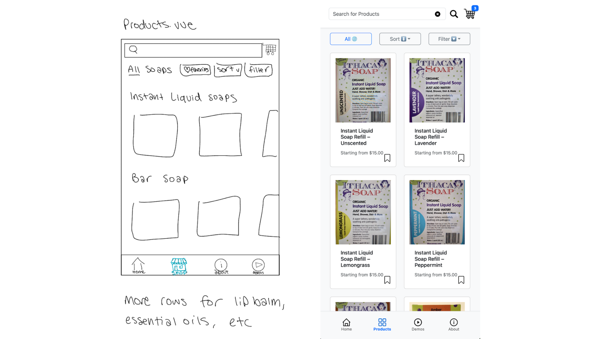
Initial Sketches
We began with low-fidelity sketches to define navigation patterns, product discovery flows, and core feature placement. Early exploration focused on:
• Persistent bottom navigation
• Search-first browsing
• Product filtering and sorting
• Cart and checkout flow
• Sustainability messaging placement
These sketches allowed us to test hierarchy and layout before committing to implementation.
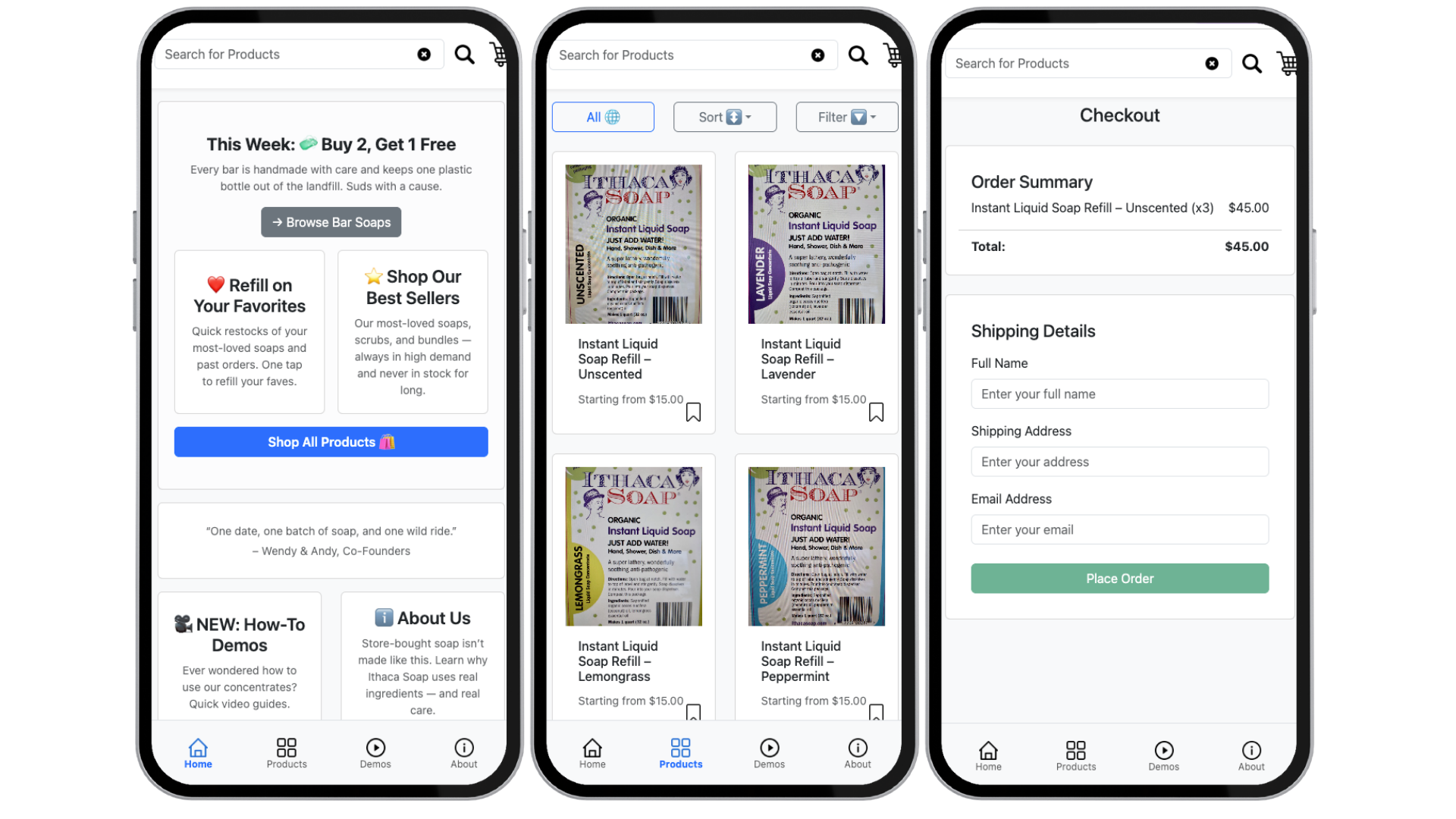
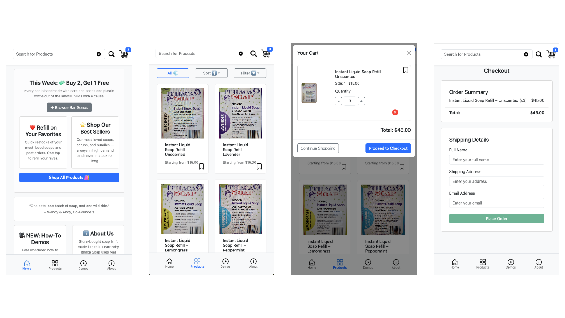
Final Designs
The final prototype included:
• Home view with promotional and sustainability messaging
• Product catalog with search, sorting, and filtering
• Individual product detail pages with variants and ingredient info
• Cart modal and full checkout flow
• Sustainability calculator
• Demo pages with step-by-step instructions
We prioritized mobile usability, clear hierarchy, and consistency across views.
Below are side-by-side comparisons of early sketches and final implemented views, highlighting how research insights translated into refined UI decisions.
.png)
.png)
.png)
.png)
Technical Implementation / Frontend Development
The prototype was built using Vue.js and Vue Router to simulate a realistic in-app experience.
Key implementation details included:
- Route-based navigation (e.g.,
/products,/products/:id,/cart,/checkout) - Dynamic product rendering using route parameters
- Modular component architecture for scalability
- Product data structured via JSON fixtures
- Variant-based pricing logic
- Responsive design across mobile screen sizes using Bootstrap CSS and mobile-first layout principles
- Reusable components including:
- Header (Search + Cart)
- CartIcon with dynamic quantity updates
- CartModal for frictionless checkout preview
- Bottom navigation bar
- ProductCard component for catalog browsing
- ProductDetail page component with variant selection and ingredient transparency
Constraints & Tradeoffs
As this was a high-fidelity prototype developed within an academic timeline, we faced several constraints:
- No backend or payment integration (checkout was simulated)
- Limited client-provided media assets
- File size constraints prevented embedding full demo videos
- Academic timeline required prioritizing core user flows over advanced personalization features
- Because individual components were graded separately, we maintained each designer’s authored sections rather than reworking them for visual consistency. As a result, some areas reflect varying stylistic approaches and design experience, but this allowed equitable evaluation while preserving team accountability.
To address these constraints:
- We simulated checkout logic to preserve the full browsing-to-confirmation experience
- Replaced video embeds with image-based instructional carousels to maintain clarity while optimizing performance
- Prioritized core e-commerce patterns (search, filter, save, cart, checkout) over secondary features
- Maintained clear ownership of individual design sections per grading requirements, while providing structured feedback and collaborative critiques to strengthen usability and alignment across the product.
These tradeoffs allowed us to focus on validating usability, sustainability messaging, and mobile experience without compromising performance.
Usability Testing and Iteration
We conducted in-person usability testing with four participants on mobile devices.
Each participant completed four task scenarios aligned with our persona goals.
Key Insights from Testing
• Users expected the “Save” feature directly on product detail pages
• The cart’s “OK” button was unclear and caused friction
• Sorting behavior felt broken when prices were identical
• Confirmation did not initially clear cart contents, reducing confidence
• The sustainability calculator increased trust and purchase motivation
• Demo content needed clearer visual guidance
Iterations based on Testing
We implemented several meaningful revisions:
• Added “Save” button to individual product pages
• Replaced unclear “OK” button with “Proceed to Checkout”
• Ensured cart clears upon order confirmation
• Improved responsive layout on small screens
• Standardized iconography across pages
• Replaced non-functional demo video with image carousel for clarity and performance
• Added stronger branding on the landing page
These changes improved clarity, reduced friction, and aligned the app with common e-commerce conventions.
Outcomes
After iteration:
• All users successfully completed core task flows
• Checkout confidence improved
• Sustainability calculator strengthened brand trust
• Navigation clarity increased across screens
This project demonstrates my ability to:
• Translate research into structured task flows
• Design intuitive mobile-first interfaces
• Implement scalable frontend systems
• Iterate based on real user feedback
• Balance user needs with client goals
Client Impact
The Ithaca Soap team responded positively to the final prototype and expressed enthusiasm about the improved mobile shopping experience. The design successfully translated their sustainability mission into a more intuitive, mobile-optimized interface, helping them envision a clearer path toward enhancing their digital customer experience.
Find the live app prototype here: https://cornell-info4340-2025sp.github.io/git-happens-project/